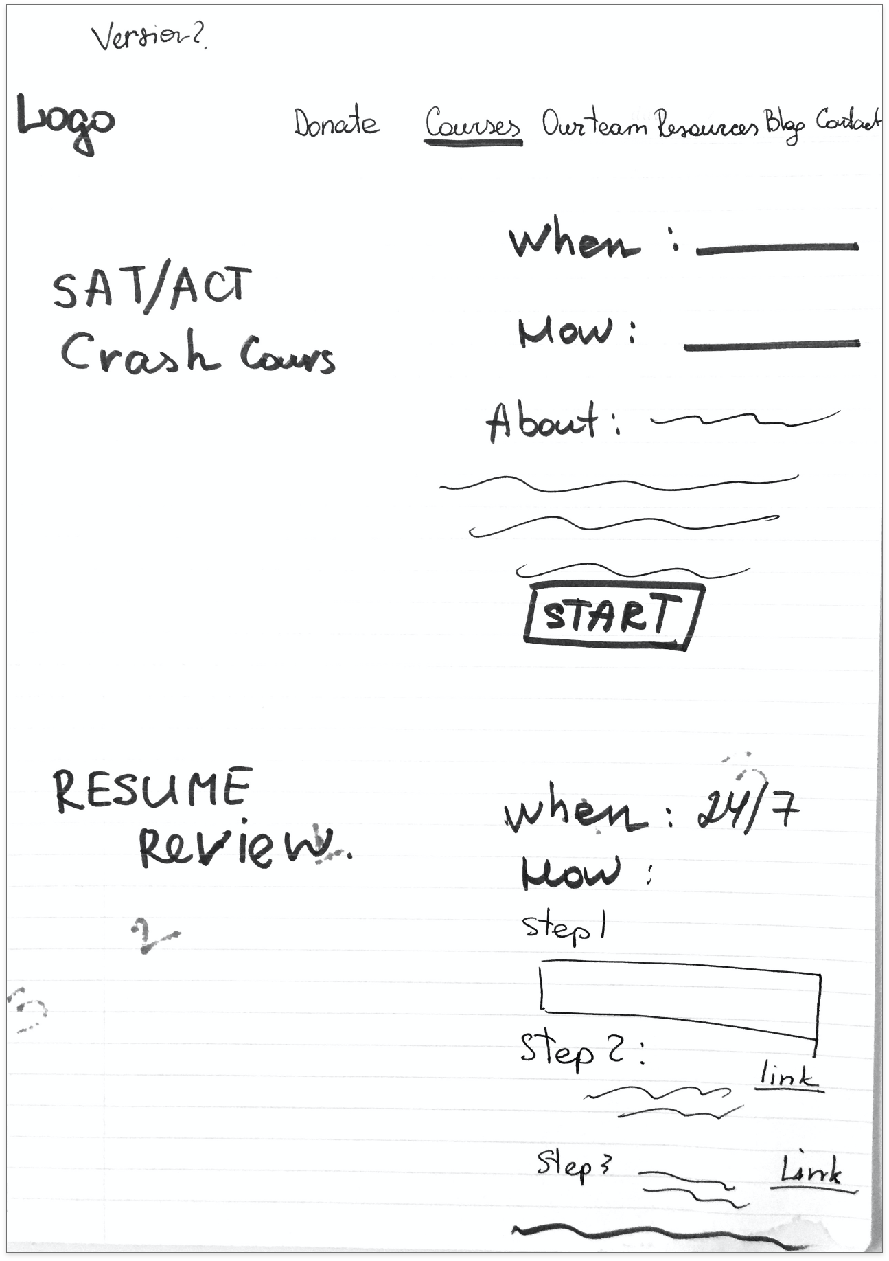
Website: At the moment, the developers of the website are modifying it to implement all of the changes I have proposed
Roles & Tools
Team: Olena Khomchenko(UX Designer), Sravya Vishnubhatla( CEO & Team Manager), Ricardo Rosales ( Co-founder), Nisha Shastry (Developer)
My Role: As a UX Designer, I conducted several user interviews, usability tests, competitive analyses, analyzed the data, and created clickable prototypes. The whole team contributed to core decision-making.
Tools: Adobe XD, Zeplin, Zoom
Note: During my research process, the startup “Get Ahead Tutor” did a rebranding and changed its name to “Ace it.” So, you will see both names. But please, do not be confused as this is the same project.
Test Prep During a Pandemic
“Ace It” is a young start-up that helps students overcome the learning difficulties that have emerged during the pandemic. “Ace It” prepares students for the SAT/ACT test and helps them with their resume through online conferences and live communication with tutors. The main feature of “Ace It” – courses and tutors are available 24/7 and it's absolutely free.
Research-Driven Process
Students’ Problems and Solutions
During the research process, I tried to identify the main problems students are facing today and why they have these problems. The target audience is students who appreciate live communication as well as virtual; they want to learn new things. They use the internet as a powerful resource for new knowledge, but there is too much information to sort through, and students find themselves getting lost in the process. During user interviews, all participants noted that today they are more nervous not about test results, but about testing during the pandemic.
“Some friends had a broken test app and they failed the test because of this! A simple crash on the server led to the fact that some of the students simply could not pass the test. Now I am worried that I will have the same situation and fail the test due to a simple server crash! This is awful!”
There is so much information that schools need to convey to students, but schools are simply not ready for online education. There are limited opportunities for students to ask questions of the teacher or their classmates. The grading system is malfunctioning, which affects the motivation of some students.
“My test was canceled 3 times. And I don’t know the date of the next test. It might be tomorrow, or in 1 week. I can’t just practice everything all day long. This is really stressful!””
To make it clearer for the design team to understand how the website should be redesigned, I decided to create an avatar to represent the potential user.
In this project, I decided not to focus on the parents because after several interviews with students’ parents, I realized that they were not interested in free courses for their kids.
After analyzing the answers I received, I managed to identify three main problems and implement their solution.
Problem #1:
There is a lot of information about the SAT/ACT test on the internet, but all of the information is different. There is no clear-cut guidance
Solution:
Added an extra page with the most common questions about the SAT/ACT test and links to official resources. This information will provide clarity to students
Problem # 2
No way to quickly ask questions of the teacher
Solution:
Highlighting the additional hours that students can use for conversations; added chatbot for fast communication with the team
Problem #3:
Stress due to technology crashes
Solution:
- Highlighting information about video recording sessions and highlighting that all users will receive a video of the lesson gives our users confidence that in case of any problems, they will still receive the necessary information and they will not need to sign up again for the course.
Who else will provide help to the students?
Our main competitors are “Khan Academy,” “ClubOz,” “Mathnazium,” “Skooli,” “Varsity Tutors,” “Mazor Test Prep Co.,” “Tutor platform,” and “NW Education Center.” All of these websites had a lot of links to social media, contact forms for fast communication, and amazing testimonials. According to the analysis of features, our website was not bad because it had a lot of features. But instead all of those features were hidden or not clear to users.
But only one competitor is free: “Khan Academy.” One of my participants shared their experience with “Khan Academy.”
“I used to try Khan Academy courses. But they give you videos without extra explanations and I couldn’t ask questions if I didn’t understand something. So, I dropped them”
Task for Users
Next step: Usability testing of old version of website. For the usability testing, we recruited 5 students who had already taken the SAT/ACT test or were waiting to take the test this year. All of them were from Seattle and between the ages of 13-15 years old. Tasks were focused on understanding how intuitive the website is, understanding the navigation issues, and what kind of information users need.
Here were some of the tasks:
Try to find out information about the SAT/ACT test practice course and Resume review.
Try to find out information about the preparation process.
Try to find out how to contact the team
Issues found during usability testing:
3 out of 5 users wanted more information about the company;
3 out of 5 users ignored the “Our mission” block (they just scrolled down);
2 out of 5 users were confused about who are the members of the team and about the price
Task: “Try to find information about the preparation process.”
This task all users failed.
Users understood where this information should be but ignored the small text with this information. All users said that there was no information on this page
“There is no information about the process here. I think I need to contact the team and then I will receive instructions”
“There is some text here, but I am not able to read this text. There is no information about the process on the website”
Steps for solving website problems
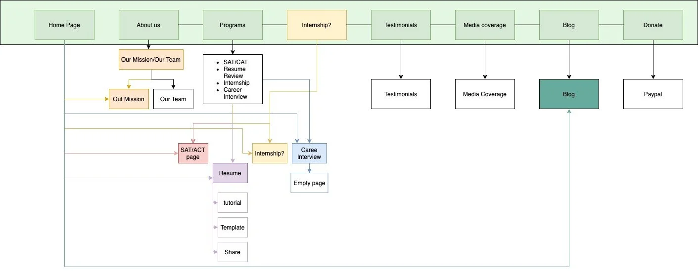
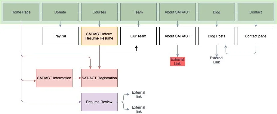
First, I started with the site map to understand the navigation and how many pages the website has.
The website has some unnecessary links and extra pages that make the website more confusing and harder to navigate. Users need to go through a lot of steps to get the information. I decided to reduce the number of pages by moving some information to the front, combining some information as well as deleting other information:
“Testimonials” and “About,” “Media Coverage,” “Our Mission” were no longer separate pages, and all information was moved to the front page;
Deleted “Internship” because Get Ahead Tutor no longer provides this opportunity;
Deleted “Career Interview” page because this course is not available right now, but in the future, I can add this course on the course page as a new block.
All of these changes connected to the top menu. By reducing the number of items, the website is less overloaded and it makes the navigation easier for users. As a result, I ended up with a simple website with fewer steps for users.
Sketches & Low-Fi Wires
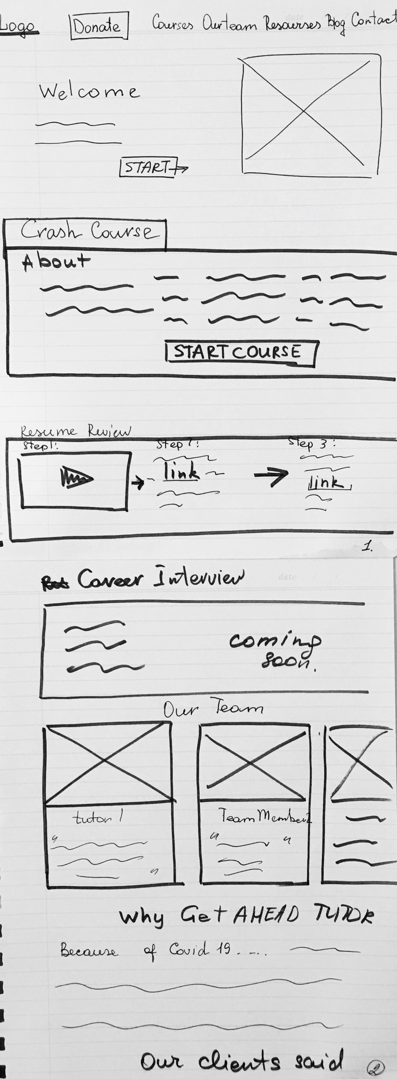
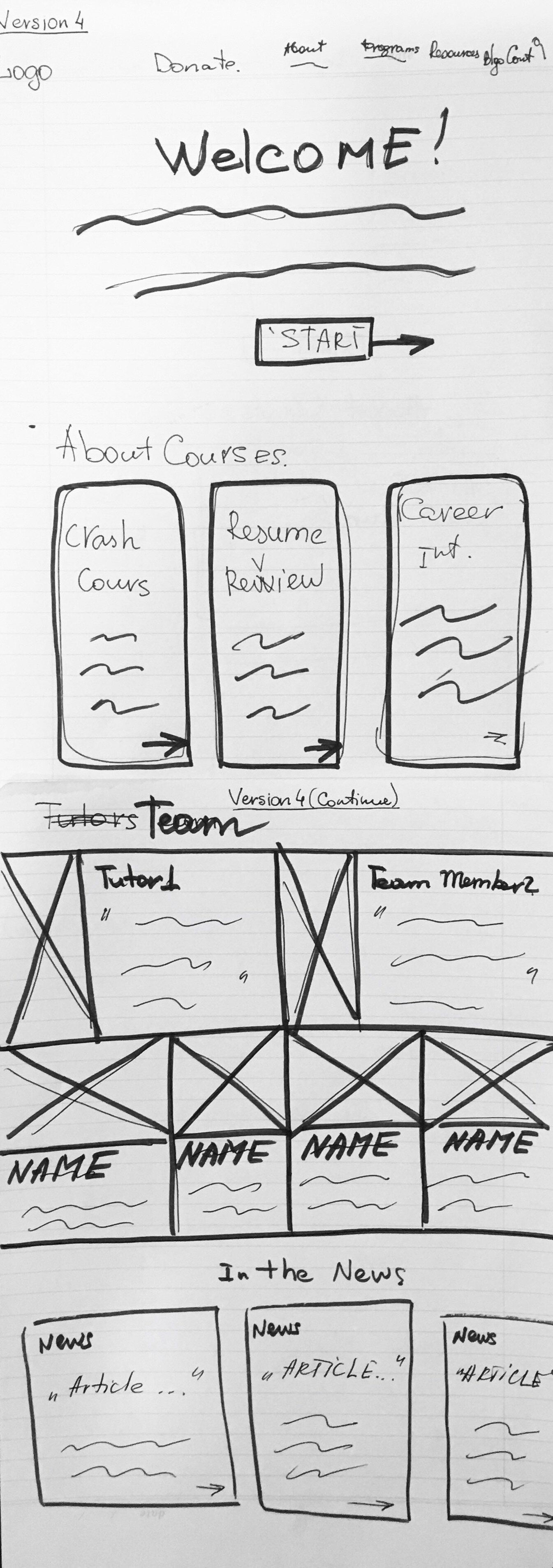
Keeping my new sitemap in my mind, I started with the easiest way to represent my thoughts – sketches. I started with a home page. Because I decided to move a bunch of information to the home page, the main problem was how to organize this information and how to highlight the main information. As you remember, users were confused about the services we provide, who are the tutors, and how to move forward in the process.
Home Page
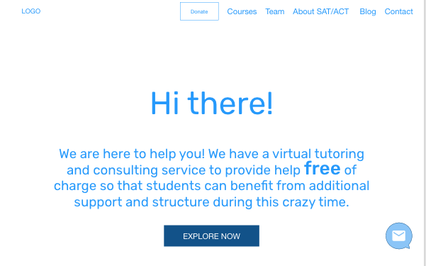
In version 1 of the home page, I decided to put a separate block as a course card with 1 CTA. I did this to show users what kinds of courses we have and how much they cost. The next block is a block with a process description. This should give users an understanding of the number of steps users must do to get enrolled in the courses.
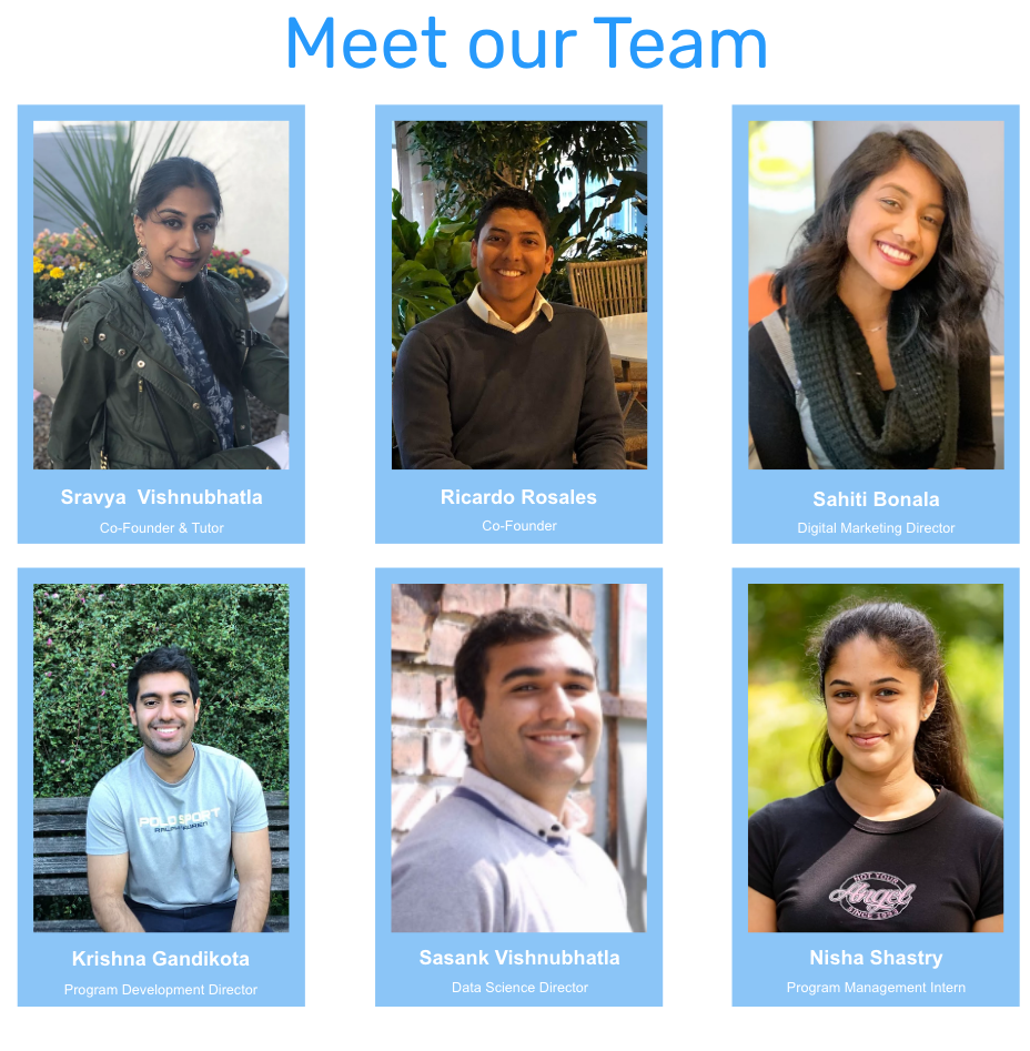
In version 2, I decided to not list the “steps” because for different courses the registration process is slightly different. Instead, I decided to put more information about the courses on the top of the page. Together with the “team members” block, it made the page overloaded. I also was not sure if users were ready to scroll to read other information. In version 3, I tried to put all of the tutors' information on the page. But the page also looked overload. So, I decided to leave only the image of the tutors without extra information.
Course Page
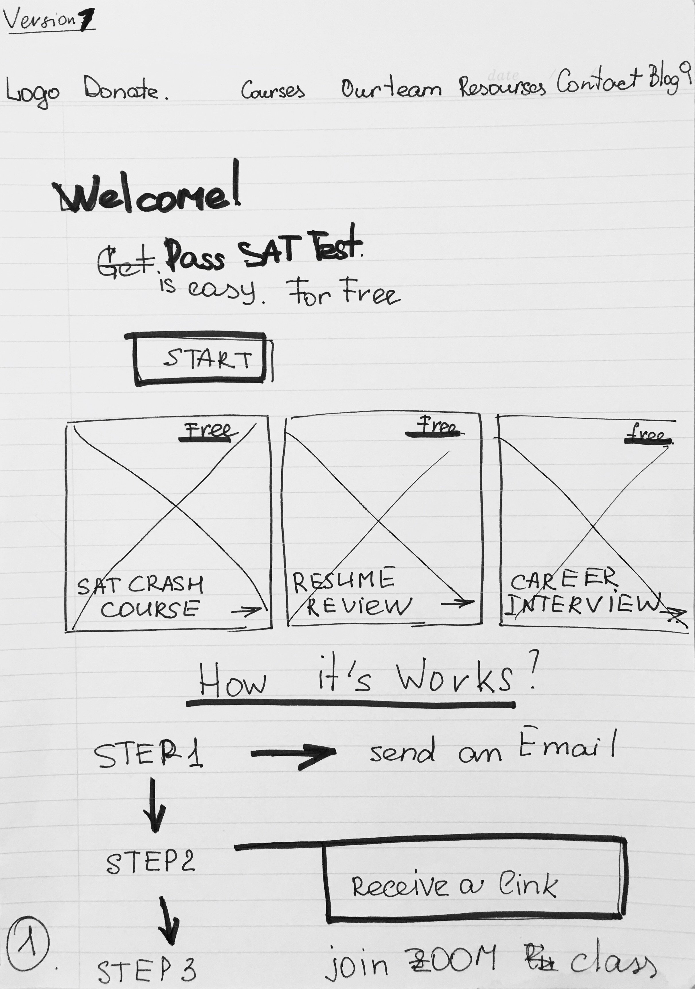
On the course page, I divided the information about courses out into several blocks because after usability testing, I understood that users were not ready to read a lot of tiny text. For “SAT/ACT Crash Course” there are no separate big steps, so I highlighted the schedules and provided small instructions. On the "Resume review" part, I decided to provide instructions as well, but because this course requires more actions from users, “Steps” are the best decision for this.
Is it easy to use?
I checked this with one more usability testing. For the second usability test, I used a low-fidelity prototype and decided to not change tasks a lot. In this way, I could establish(check) if I fixed previous problems.
This is what I asked users to do:
Find the information about the team and tutor;
Find steps they need to do for Resume Review;
Register for the SAT-ACT Crash Course;
During the second usability test, users were able to find more information about our services and the price, they understood who was a tutor, and all of participants were successfully registered in the “SAT/ACT Crash Course” without any help.
However, users had some struggles:
There was still a lot of text on the first screen. Users would just read the first sentence and scroll down;
Users are interested in more information about tutors and speakers: their background, hobbies, experiences;
“Sravya is a tutor. But what kind of background does she have? Is she a math teacher?”
3. Users were interested in quantitative data about previous students;
4. 3 out of 5 participants said that they prefer to send an email to members of the tutor team from their personal email instead of using a form.
Changes
Home Page
“Centered text hard to read. ”
Less text
Text positioning - left
About the Team
“Who is a Data Science Director? Why I should know about this person?”
Added to all team members’ profiles their position in “Ace It”
Added social media links
More information about the speaker’s experience
Contact with Team
Added “Get Ahead Tutor” email on the home page to provide as many opportunities for communication with the team as possible


