Roles and Tools
Team: Olena Khomchenko ( UX Designer), Eszter Hollenback ( UX Designer)
My Role: As a UX Designer, I conducted several user interviews, analyzed the data, and was also responsible for individual visual concepts.
Tools: Adobe XD, Dropbox
How Can We Organize Our Free Time Near the House?
We all know that today there is a huge selection of events for all ages, on any topic and in different parts of the city. Sometimes we want to support our local businesses, and not waste our time for the road. For all this, there are a huge number of applications, groups, and clubs of interest. One such app is the ZEACON app.
ZEACON is an application that aims to help local companies become more visible and help solve the problem of poor attendance. ZEACON also helps users find cool and interesting events that are just a few steps away and track these events in real time.
The goal of this project was to redesign the current app.
Research-Driven Process
ZEACON’s Problems
The purpose of this project was to make the experience of using the ZEACON application simple and understandable for the user.
User’s challenges today:
Problem 1 : ‘Home’ Page
Contrast between map and pins color is not enough
Hard to see the map
Problem 2: ‘My Zeacons’ Page
Confusion between “Interested,” “Saved,” and “Past.”
It is not clear what kind of people are below the card.
Problem 3: Settings
There is no way to delete your account
Not clear what kind of data is stored here
Other Problems
We also drew attention to the following disadvantages:
On the Android platform, the ZEACON app generally does not work
Choosing date filter doesn’t work. The selection after the date does not match with the date
Some links, like “add to my calendar,” don’t function.
Categories occasionally do not match with the event type (e.g., Escape room in family section, even though they are not for young children)
What Did We Learn from Users?
Before starting a redesign, we decided to find out from our potential users what they think about the ZEACON app. Namely, how much information is available and how intuitive the application is.
Here are some tasks for our users:
Find one event from the category “Family”
Find the same event using the filter option
We also asked our users to think aloud and share their thoughts about issues. Potential users quickly completed their tasks, and we were able to conclude that our first thoughts about poor navigation were not confirmed. However, after analyzing user quotes regarding other aspects, we realized that there were problems with the availability of information. Also, in the application, there is information which our users are not interested in and which is not understandable, and some of the necessary information is just missing.
There are some quotes:
“Who are these people? Why am I seeing them? I don’t care who else is going to this event! Especially if they are strangers!”
The user’s confusion was caused by the small avatars of other users on the event card (unnecessary information).
“How do I understand how much money I need for an event? ”
The user was confused about whether he had to pay for this event or not (lack of information).
“ Today is Feb 15, what is the Feb 11 event doing here? If it is not a one-day event, then why isn’t that more prevalent?”
This user made it clear that two problems are possible at the same time: the unknown duration of the event (lack of information) and the event that was a very long time ago is shown, it is no longer relevant (unnecessary information.
Other quotes :
“What do saved events means on the My ZEACON page? Does that mean I already agreed to go on them? What if I change my mind? What is the difference between ‘Interesting’ and ‘Saved’? I don’t think I will share the event with strangers. If I want to invite friends, then I will just share this event through messages. How do I add an event to the calendar? The button doesn’t work!”
This one big quote confirmed our initial thoughts: users do not understand the difference between Saved and Interested. Also, they will not share unnecessary information with strangers, but only with friends. And the user pointed out that not all buttons work.
“Where are the filters here?”
This was the first question that a user asked us after we asked him to find an event using filters. The task did not specifically indicate which filters to use. The user was able to find the search bar, but he could not understand how the filters were determined. The user also indicated that he would like to see filters directly on the categories page, and not on the main page.
After analyzing the test results, thoughts, and comments from users, we came to the following problem statement:
“How might we help users finding their event fast and make the app more memorable, enjoyable, purposeful for users?”
Sketches and Testing
Using the problem statement and the thoughts of users, we proceeded to sketches. We decided to create several versions of the same page to conduct A / B testing.
Home Page
Version 1
This is the first version of the Homepage. It is not much different from the original, but we first showed users what is available to them now in their district. At the same time, the user was able to choose categories or popular events if they wanted to do so. 1 out of 4 users chose this version
Version 2
In this version, we decided to make an outstanding menu on top. It was also for the purposes of not covering the entire screen with categories and filters. 3 out of 4 users chose this version
Version 3
In this version, we decided to move the menu from the top to the lower right corner, as some devices have rather large screens. And the placement in the lower right corner will help to perform basic actions with one finger. In the future, you can provide the user with the opportunity to place this main menu on any point on the screen. 3 out of 4 users chose this version
My ZEACON
Version 1
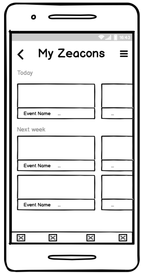
This is the first version of the MY ZEACON page. As you can see, here are two options for this page. This version was created to determine what is more understandable to our users: close MY ZEACONS using the already known icon and access to the main menu from any page, or simply leave the back arrow and add additional settings. 4 out of 4 users liked both versions
Version 2
This version of this page is not very different from the previous version, but we decided to remove the division into categories such as “Maybe” and “Past,” and simply provide users with information on events in chronological order. As you remember, users were misled. 2 out of 4 users chose this version.
Version 3
When creating this version of the page, my team decided to give users access to categories directly from the MY ZEACONS page. 0 out of 4 users chose this version
Categories
Version 1
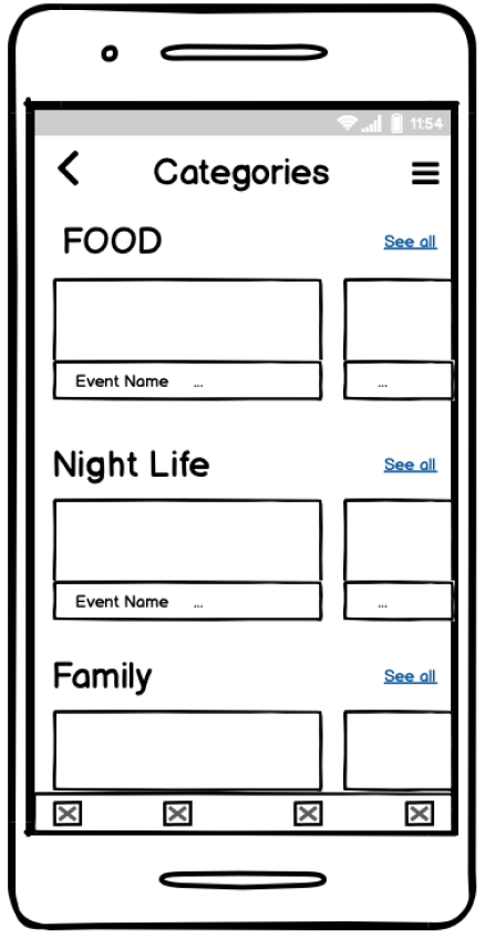
Category pages in this application are one of the main components. The user can easily select the desired category of events. As you can see, there is not much difference between the two screens. These pages were used for A / B testing. We tried to understand what is more convenient for users: just swipe the page up - down or use the arrow to return. 0 out of 4 users chose this version
Version 2
This is the original version of the category pages. We decided to add only the ability to customize our categories. 0 out of 4 users chose this version.
.After testing this page, we came to the conclusion that we would not make a separate page for categories, but would instead provide users with access to the category directly from the main menu.
Messages vs. Notification
We decided to check again how important messages and notifications are to our users. Therefore, we offered our users several options for message and notification pages.
Version 1
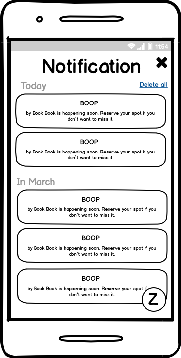
First, we provided an option that combines messages and notifications. This was supposed to allow users to have quick access to a particular page and the ability to manage messages and notifications without unnecessary clicks. 0 out of 4 users chose this version.
Version 2
Providing these two pages separately, we still wanted to leave the possibility of communication and notification, but as separate independent pages. 4 out of 4 users chose this version
Results and Conclusions After Testing
After conducting A / B testing and analysis of its results, the following conclusions were made:
Users prefer as much information as possible on the screen. They want to understand which page they are on and filter the information to the maximum.
Information should be relevant for today and the near future. What was before they are almost not interested in.
Users are not configured to share their information and communicate with strangers in the application for events.
What Did We Get After All the Research was Done?
As a result of the research, we made the following changes to this application
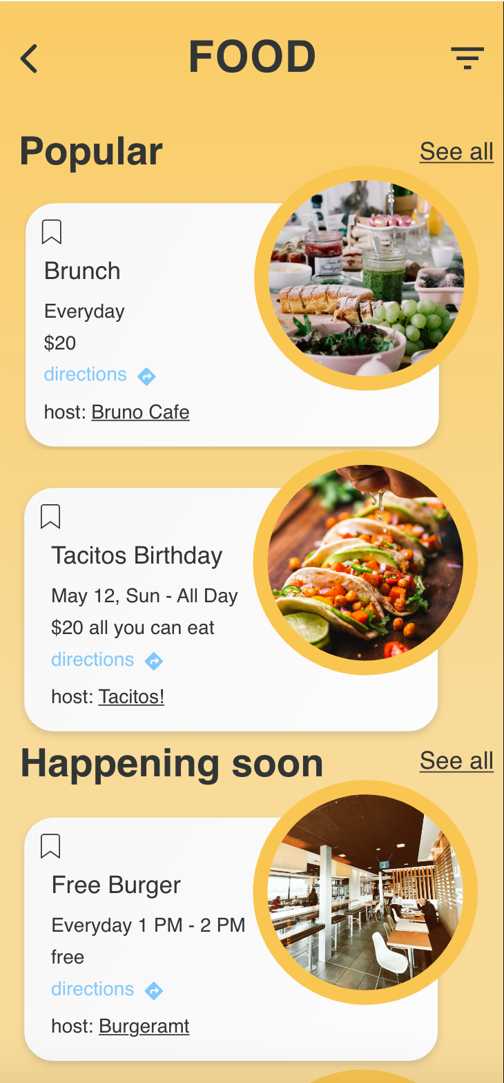
Added filters
For each separate category, we have developed separate filters that assist users in quickly finding the necessary event, thereby avoiding endless scrolling.
Saved and past events
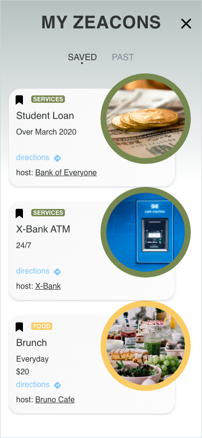
We left only two categories on the MY ZEACONS page, while putting all of the past events in a separate category (at the moment, Saved is a mess).
Separate page for notifications
Users are interested in notifications, so we gave them the ability to manage them from a separate page without mixing with messages
Quick access to the event directly from the home page
Users have the opportunity to find out about the upcoming event, add it to their calendar and access the host directly from the home page, without spending unnecessary time searching through the Category section.


